7 Color theories to apply in interior design
Color theory is the study of how colors interact, influence emotions, and shape perceptions, forming a color theory interior design framework for designers, architects, and creators to select harmonious palettes that communicate moods or messages effectively. Interior design depends on these principles because colors can define spaces, highlight architectural features, and evoke desired atmospheres while guiding how occupants feel and behave. This article presents seven essential color theories that can be applied in interior settings to enhance both aesthetics and functionality. Continue exploring these techniques to refine your design approach and create visually engaging spaces.
What is color theory?
Color theory is the scientific study of how different hues interact with each other and influence human emotions and perceptions. This systematic approach provides artists, designers, and creators with a structured framework for selecting colors that create visual harmony, convey specific messages, or generate particular moods within a space.
The principles within color theory help professionals understand which color combinations work effectively together and which combinations might create visual discord or confusion. Interior designers use these guidelines to craft spaces that feel balanced, purposeful, and emotionally appropriate for their intended use.
7 Color theories to apply in interior design
There are seven fundamental color theories that provide interior designers with proven methods to create stunning and functional spaces. These principles form the foundation for successful color application in residential and commercial projects:
- Color wheel
- Color schemes
- Color temperatures
- Color combinations
- Colors’ psychological effects
- Color context
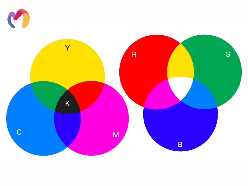
- Color mixing
Each theory offers unique insights and practical applications that transform ordinary rooms into extraordinary environments.
Color wheel
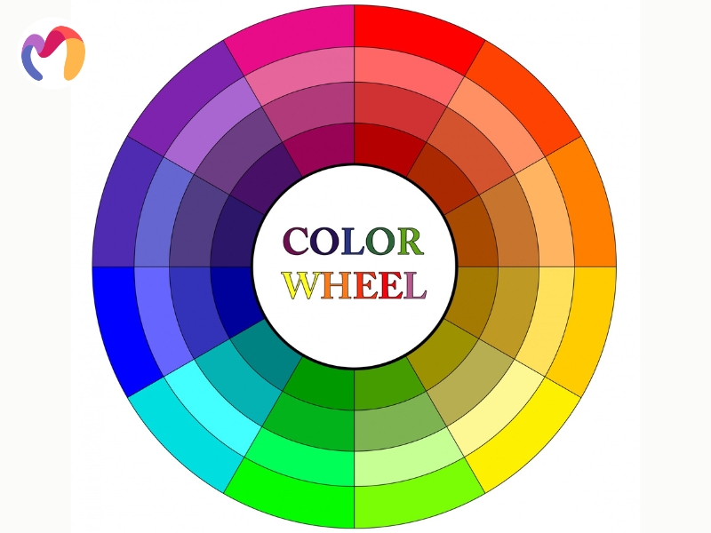
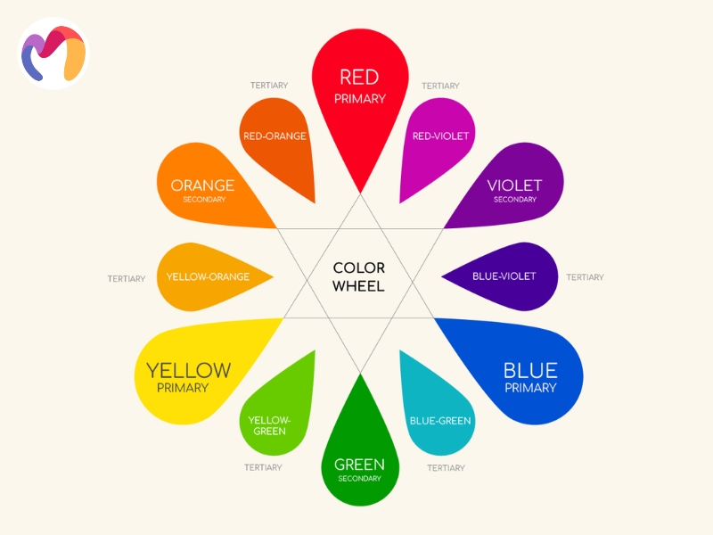
The color wheel is a visual tool developed by Sir Isaac Newton in 1666 that illustrates the relationships between primary, secondary, and tertiary colors, arranged in a circular format. This structured arrangement of 12 core colors demonstrates how different hues interact and combine to create harmonious palettes for interior spaces.
Designers use the color wheel to make informed decisions about color combinations, contrasts, and overall harmony within rooms, making it an indispensable tool for effective interior decorating. The wheel organizes colors into three distinct categories that form the foundation of all color theory applications in design.
- Primary Colors: Red, blue, and yellow serve as fundamental hues that cannot be created by mixing other colors together, providing the building blocks for all other colors in the spectrum.
- Secondary Colors: Green, orange, and purple emerge from mixing two primary colors are mixed together, creating balanced hues that enhance and complement the overall aesthetic of interior spaces.
- Tertiary Colors: Yellow-orange, red-orange, red-violet, blue-violet, blue-green, and yellow-green result from combining primary colors with neighboring secondary colors, adding depth and subtlety to design palettes.

Color schemes
Color schemes represent the strategic arrangements or combinations of colors used in interior decoration, and seven distinct schemes provide interior designers with systematic approaches for creating visually appealing and harmonious spaces. Each scheme offers unique characteristics and applications that can transform rooms while serving different aesthetic and functional purposes.
Monochromatic Color Schemes
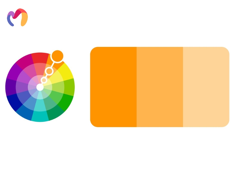
Monochromatic palettes utilize variations of a single color, incorporating different shades, tones, and tints of the same base hue to establish unity and simplicity throughout interior spaces. This approach creates harmonious and calming atmospheres that feel cohesive and timeless, making it particularly effective for bedrooms and living areas where relaxation takes priority. Designers often choose monochromatic schemes because they provide visual cohesion while allowing personality to emerge through variations in texture and subtle differences in hue, resulting in sophisticated and elegant room compositions.

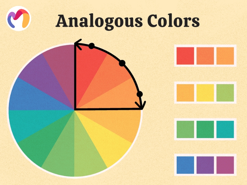
Analogous Color Schemes
Analogous palettes feature colors positioned adjacent to each other on the color wheel, such as blue, blue-green, and green combinations that create natural harmony and visual flow. These schemes produce calming effects that work particularly well in spaces designed for peace and relaxation, as the smooth transitions between similar hues feel comfortable to the eye. Interior designers favor analogous colors because they deliver harmonious results without requiring extensive use of neutral tones, while the gentle color progressions enhance the overall aesthetic appeal of any room.

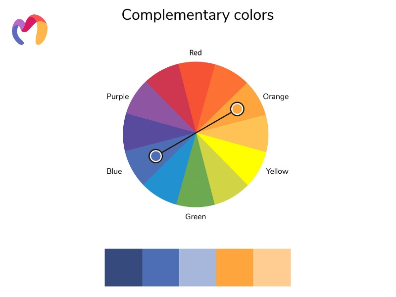
Complementary Color Schemes
Complementary palettes pair colors positioned directly opposite each other on the color wheel, such as red and green or blue and orange, creating high contrast and vibrant visual impact. These dynamic combinations generate energizing and visually interesting environments that can enhance the aesthetic appeal of any interior space, though they require careful balance to avoid overwhelming the senses. Designers typically favor one complementary color while using the other as an accent against neutral backdrops, ensuring the bold contrast creates excitement without causing visual fatigue.

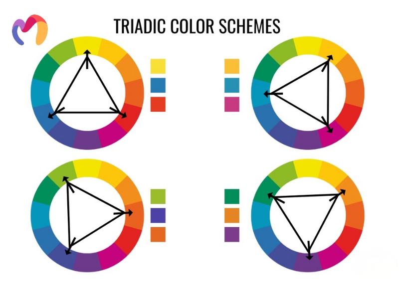
Triadic Color Scheme
Triadic arrangements consist of three colors positioned evenly 120 degrees apart on the color wheel, forming a triangular pattern that creates vibrant yet balanced color combinations with high contrast. This scheme delivers sharp visual contrast while maintaining harmony, making it easier to work with than complementary palettes and particularly suitable for bold, colorful design approaches. Designers appreciate triadic schemes because they offer excellent color balance and can create striking focal points while maintaining overall visual stability throughout the space.

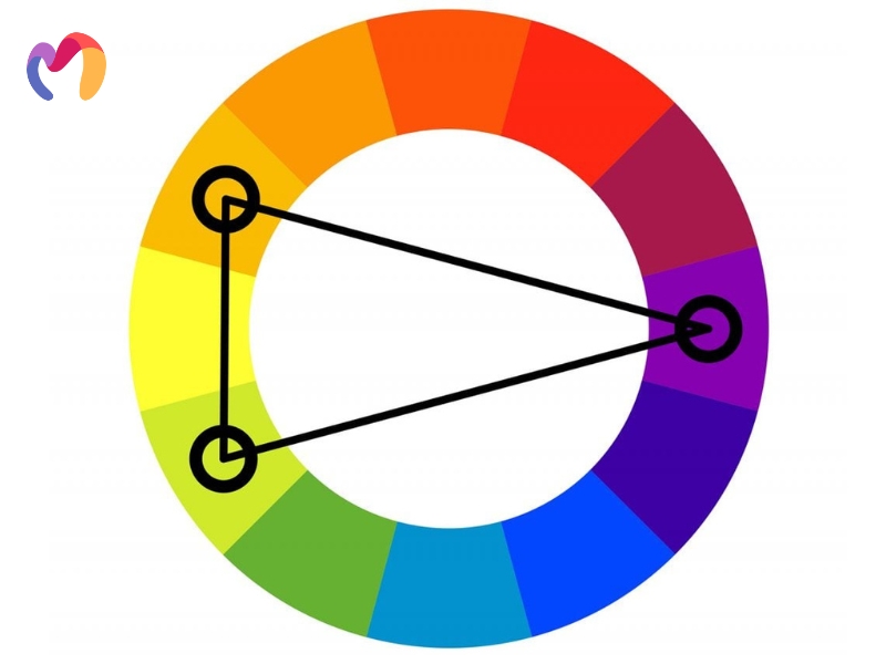
Split-Complementary Color Scheme
Split-complementary palettes combine one base color with the two colors adjacent to its direct complement, offering dynamic contrast while remaining gentler and more harmonious than traditional complementary schemes. This approach provides visual interest and balanced warm-cool contrast while being more beginner-friendly than direct complementary pairings, typically following a 60-30-10 proportion for optimal harmony. Interior designers use split-complementary schemes when they want energetic yet comfortable environments that offer flexibility for highlighting architectural features and accent elements.

Tetradic Color Scheme
Tetradic palettes incorporate four colors arranged into two complementary pairs, creating the richest and most complex color schemes available for interior design applications. These arrangements can form rectangular patterns with colors spread at specific intervals or utilize two complete sets of opposites on the color wheel, offering tremendous flexibility for vibrant compositions. Designers must balance tetradic schemes carefully by establishing one dominant color to prevent visual overload, as the complexity requires thoughtful application to achieve harmonious results.
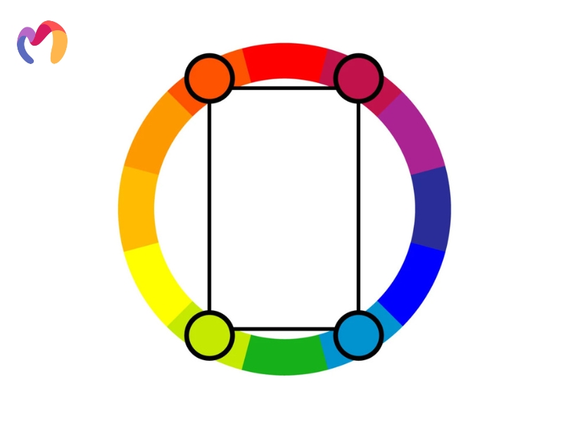

Square Color Scheme
Square arrangements feature four colors positioned evenly at 90-degree intervals around the color wheel, producing colorful palettes with balanced mixes of contrasting hues. This scheme creates rich and varied color combinations that need thoughtful application to maintain visual harmony, working best when one color dominates while others serve as supporting accents. Designers utilize square schemes for projects requiring high visual interest and balanced color tension, although careful planning prevents multiple strong colors from creating chaotic or overwhelming environments.
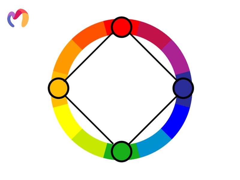

Color temperatures
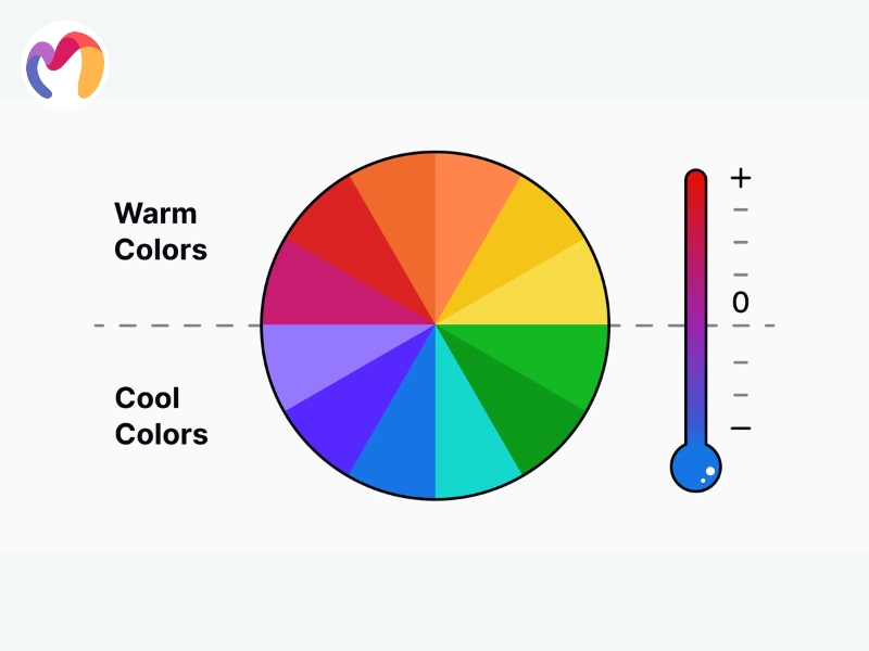
Color temperature determines whether hues appear warm or cool, based on their position relative to blue and yellow on the color wheel, influencing how spaces feel and function psychologically. This principle guides designers in creating environments that support specific activities and evoke desired emotional responses.
Color temperature classifications divide all hues into three distinct categories that influence spatial perception and emotional response, with each type serving specific design functions and creating different atmospheric effects within interior environments.
- Warm Colors: Reds, oranges, and yellows generate vibrancy and foster social interaction, working best in active spaces like living rooms and dining areas where conversation flows naturally. Large or naturally cool rooms benefit from these hues, which create intimate and welcoming atmospheres.
- Cool Colors: Blues, greens, and purples evoke relaxation and tranquility, making them ideal choices for bedrooms, bathrooms, and meditation spaces where calmness prevails. These tones visually expand smaller rooms while creating fresh, clean environments that provide psychological relief.
- Neutral Colors: Beige, gray, white, and black serve as sophisticated backdrops that prevent visual overload while grounding both warm and cool palettes. These versatile hues work effectively as base colors for large surfaces and architectural elements throughout any space.
Mixing warm and cool colors in proper proportions prevents monotony while achieving balanced schemes that feel dynamic yet harmonious. The adjacent placement of opposite-temperature colors creates visual interest and allows designers to shift the perceived temperature within spaces.

Color combinations
Color combination theory allows interior designers to craft harmonious and emotionally effective spaces by selecting, balancing, and proportioning colors using the color wheel and proportion guidelines within the context of the room’s desired atmosphere and function. This systematic approach transforms random color selections into purposeful design decisions that support both aesthetic goals and practical living requirements.
Successful application of color combinations begins with establishing a foundation using primary colors, as red, blue, and yellow serve as the base for all other hues and provide fundamental starting points for any palette development. Incorporating these three primary spectral colors, along with additional hues and white, creates rich varieties of palettes that offer designers extensive creative possibilities. These strategic combinations guide professionals from basic hues to secondary and tertiary colors through careful mixing and layering techniques that build complexity while maintaining visual coherence.
The color wheel serves as the most important tool for visualizing relationships between primary, secondary, and tertiary colors, allowing designers to make informed decisions about color placement and interaction. Selecting colors based on their wheel positions through complementary, analogous, triadic, or split-complementary arrangements helps designers achieve either harmony or dynamic contrast, depending on project requirements.

Colors’ psychological effects
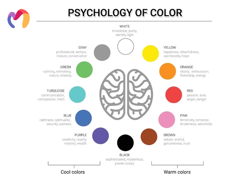
Color psychology guides designers to select hues that evoke specific emotional responses and create intentional atmospheres within residential and commercial spaces. Strategic color combinations significantly shape emotions, influencing whether environments feel peaceful or stimulate creativity and productivity.
Research demonstrates that cool and warm tones produce distinctly different psychological effects on residents’ moods and behaviors, making color temperature selection a powerful tool for achieving desired atmospheric outcomes in any interior space.
- Cool Tones: Blue and green hues generate calming effects that contribute to tranquility and relaxation, making them favored choices for bedrooms and meditation spaces. These cooler colors create a peaceful environment that helps residents unwind and find serenity after stressful days.
- Warm Tones: Red, orange, and yellow hues create an energizing effect that makes residents feel more active and engaged in their surroundings. Yellow evokes joyful emotions and optimism while red generates excitement and passion, creating dynamic atmospheres that stimulate conversation and social activity.
Color perception changes based on surface textures and finishes, with glossy materials making hues appear lighter while rougher textures tend to darken colors and alter their emotional impact. Strategic color harmony across interconnected rooms affects how entire spaces feel and function for daily living.

Color context
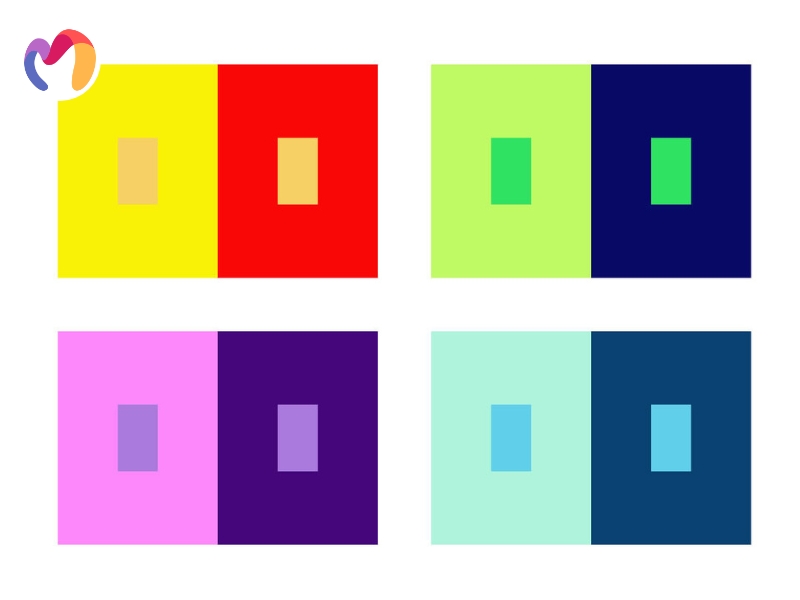
Color context refers to how the perception and meaning of specific hues are influenced by their surroundings, including adjacent colors, lighting conditions, environmental factors, cultural backgrounds, and individual psychological responses. This phenomenon demonstrates that colors possess different meanings and emotional impacts depending on their placement and the elements that frame them within interior spaces.
Successful color schemes depend entirely on contextual factors, as the same hue can evoke vastly different feelings and create contrasting atmospheres based on how designers integrate it with surrounding elements. Physical space characteristics and psychological considerations work together to determine whether color choices achieve their intended effects and create the perfect atmosphere for occupants.
Consider how white appears dramatically different in various contexts: white walls in a minimalist Scandinavian living room create feelings of serenity and spaciousness, while the same white in a sterile hospital setting may evoke clinical coldness and anxiety.
Similarly, deep red can evoke a romantic and intimate atmosphere when paired with soft lighting and luxurious textures in a bedroom; however, the same red tone might appear aggressive and overwhelming when used extensively in a small office space with harsh fluorescent lighting.

Color family
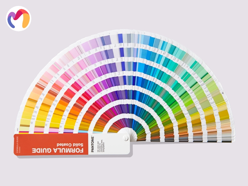
A color family is a group of colors that share the same dominant hue, with variations in saturation and brightness. Interior designers and homeowners need to understand which colors work harmoniously together and how to derive additional shades from each base color to create cohesive and visually appealing spaces. This knowledge forms the foundation for successful color planning in any design project.
Color families consist of four distinct variations that allow designers to create depth, interest, and harmony within interior spaces while maintaining visual unity and preventing color conflicts that can disrupt the overall aesthetic flow.
- Hues: Pure colors found on the color wheel form the foundation of all color mixing and serve as starting points for creating complex interior palettes. Selecting one base hue allows designers to generate entire room schemes with variety and nuance while maintaining unity throughout different elements.
- Tints: Adding white to any hue creates lighter, softer versions that bring brightness and airiness to interior spaces, making rooms feel more spacious and calming. These pastel variations work particularly well for walls and bedding in areas where relaxation and tranquility take priority over bold visual statements.
- Shades: Combining black with a hue produces deeper, richer colors that add sophisticated depth and dramatic visual weight to interior designs. These darker variations serve perfectly as accent walls, furniture colors, or statement pieces that anchor room compositions and create intimate, cozy atmospheres.
- Tones: Mixing gray with any hue creates muted variations that reduce visual intensity, achieving subtle, balanced effects suitable for both professional and relaxing environments. These understated colors serve as excellent choices for transitional elements, such as rugs and lampshades, that complement without competing for attention.

10 Tips to better use color theory in your interior design
Professional interior designers can transform any space into a harmonious and emotionally resonant environment by applying these ten proven color theory strategies that address both aesthetic appeal and functional requirements for residential and commercial projects.
- Start with any single color: Color psychology helps designers understand client requirements and space ambiance needs while establishing a foundation for palette development. Selecting one base color allows professionals to use the color wheel for choosing complementary hues that work harmoniously together.
- Draw colors from existing patterns: Designers should select color schemes from the largest pattern or element already present within the space for cohesive results. Dominant patterns featuring specific hues like red or pink guide color choices that naturally complement these existing architectural or decorative elements.
- Apply the dark-to-light vertical rule: Darker colors work best for floors, while medium tones suit walls and lighter shades complement ceilings effectively. This vertical gradient creates visual illusions that make rooms feel more spacious, balanced, and naturally proportioned.
- Master the color wheel relationships: Color wheel references help determine which hues work harmoniously together in interior applications. Complementary, analogous, or triadic relationships create intentional combinations that feel cohesive and professionally planned throughout any space.
- Embrace gray as a versatile neutral: Gray tones complement a wide range of interior styles, from modern minimalism to Victorian elegance, with remarkable adaptability. Different gray shades paired with contrasting accent colors create sophisticated palettes that feel both timeless and contemporary.
- Follow the 60-30-10 proportion rule: Color allocation should include 60% of the dominant color for walls, 30% of the secondary color for upholstery, and 10% of the accent color for accessories. This proven formula creates balanced, visually appealing interiors with proper focus points and dynamic contrast.
- Balance warm and cool contrasts: Neutral colors, when combined with both warm and cool tones, create sophisticated harmony within interior spaces. Gray palettes paired with warm honey tones or cool blues achieve balanced color relationships that feel professionally executed.
- Use monochromatic schemes for small spaces: Single-color palettes with varying shades and tints work particularly well in compact areas, such as bathrooms or studies. This approach makes small spaces feel larger while maintaining visual cohesion throughout the entire room.
- Reflect personal style in color choices: Individual client preferences should guide color combination development for personalized interior design solutions. Personal styles, ranging from modern minimalism to traditional influences, determine the appropriate palette selections for living and dining areas.
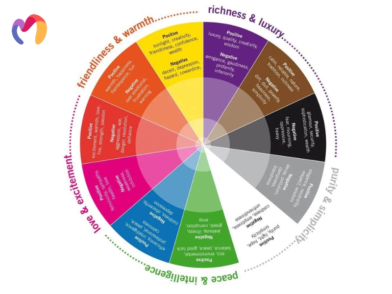
- Choose colors based on desired emotions: Selecting colors according to their emotional impact helps create spaces that support specific activities and moods. Darker purples convey richness and luxury while lighter blues promote calmness and tranquility in residential environments.

This comprehensive guide explores seven fundamental color theory interior design principles that empower designers to create harmonious and functional spaces through practical frameworks for color wheels, schemes, temperatures, combinations, and psychological effects. Professional designers can now implement these proven theories while leveraging 3DMAXTER’s extensive 3D model library, which offers a diverse range of interior and architectural assets in 3ds Max format (.max) and in exported .obj and .fbx formats compatible with most software. We provide high-quality 3D models at competitive prices, backed by our 100% satisfaction guarantee, so download premium models today to bring your color theory knowledge to life in stunning visualizations.
3DMAXTER LTD
- Email: [email protected]
- Phone: +1 (929) 450-2898
- Address: 95-38 Queens Blvd, Rego Park, NY 11374, USA